Visualizing a hospital contact network
02 Jun 2016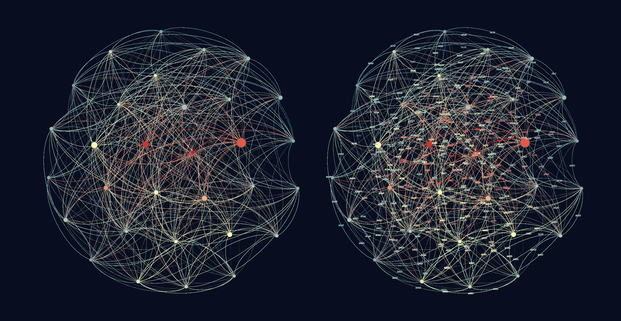
The network plot above (best viewed in its own tab in a browser) was accomplished using the following:
Hospital ward contact network data
“This dataset contains the temporal network of contacts between patients, patients and health-care workers (HCWs) and among HCWs in a hospital ward in Lyon, France, from Monday, December 6, 2010 at 1:00 pm to Friday, December 10, 2010 at 2:00 pm. The study included 46 HCWs and 29 patients.”**
**P. Vanhems et al., Estimating Potential Infection Transmission Routes in Hospital Wards Using Wearable Proximity Sensors, PLoS ONE 8(9): e73970 (2013).
(This seems like good data to consider in the context of highly infectious diseases.)
This is a directed graph, with contact from one individual to another. The color of the edge indicates direction from the same colored node. The results were filtered down by degree range to emphasize the nodes with highest contact (degree).
Node size is based on betweenness centrality, indicating influential nodes for highest BC value. Color ranks the degree of edges to the node. Red is many, blue is few. Nodes have been filtered by degree range (>500). A Fruchterman-Reingold algorithm was used for layout with a large area and moderate gravity to show density of contact.
This chart shows the highest amount of contact between hospital workers and patients with lowest contact being on the outer edges of degree and BC values.
I had a hard time finding the data-set and graphical tool combination that satisfied my requirements as I perceived them. I eventually settled on Gephi, an open-source tool. It works terribly on Linux, but okay on the Mac. Then I had to find a data-set that wouldn’t fry my poor MBA. Basically, I couldn’t use any “big” data. I had to find some medium data, whatever that would turn out to be. For a network (edge-list) plot, I found I couldn’t use anything with more than 20,000 records, or else my Mac would freeze for too long for me to actually finish the work under a deadline. Not surprisingly, it was hard to find a small, yet interesting, graph of data.